Presenting your game: Icon + Description
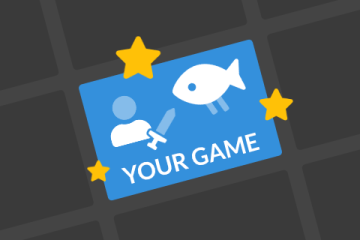
You've just spent 48 hours developing an amazing game, and now you want people to play it. You could share the game with your friends, and if your game is great it might get word-of-mouth on the Discord server, but most people are probably coming from the Games page. Aim to stand out from the crowd with a great icon and description!
Note: The following is opinion based on my own experience with participating in gm(48) over the past 5 years. You may or may not agree, and you can surely find success by doing your own thing.
- High quality art, maybe your game’s logo or key art drawn specifically for promotion.
- Use bold colours, high saturation and contrast can make you stand out from the duller ones
- An animated gif, of gameplay or something else (logo, title screen, some art asset, etc.)
- Including lots of motion can trick people's brains into looking at your icon. But don't go too crazy lol.
- If your game is 3D then you should absolutely emhasise that with an animated icon, because people go bananas for 3D games.
To see what I mean, try going to a random gm(48)’s Games page and sort by Unpopular. You will see the least popular games at the top, and the most popular games at the bottom. The least popular games will likely be a mix of default icons and less eye-catching art, whereas the popular ones (i.e. the games that people view, download, and in general interact with the most) likely have more appealing art and nicely animated icons.
Do note that more and more people use gifs today than in the past. It is getting harder and harder to stand out from the crowd, so be creative. Doing something completely unexpected can get you lots of clicks. Meme/shitpost games seem to get clicks, too (intentionally bad art can be "good" art!) - if you see something and your immediate reaction is "wait wtf is this", you're probably gonna click on it.
💡 Examples of icons I like:
 0x0D
0x0D
Not all games need super comprehensive descriptions. Less can totally be more in the right circumstance. What your description needs is obviously your call, but here's a list of sections you could add if it makes sense for your project:
-
Pitch / Info: A few short sentences about your game, to give people an idea of what they're getting into.
-
Controls: If your controls aren't explained in the game, it's a good idea to do so here.
-
Bugs / issues: Are there any bugs or other issues in the game that the player should know about? List them here with instructions on how to deal with them.
-
Credits: Who made the game, and who did what (code, art, music etc.)? I'd say this is optional now, as team members are displayed in the sidebar, but giving extra credit is never a bad idea.
-
Assets used: Did you use any Marketplace assets or other stuff not made by you within the 48 hours? You're not required to list them (unless their licenses require that), but attribution is nice :)
-
High score: Some people list their game's current high score and who achieved it, which can be a fun incentive for some people to try and beat it.
-
Screenshots / video: Having some screenshots of the game could make people go "ooh, this looks nice, I want to play it". But keep in mind you don't want to add a billion uncompressed PNGs that make the page super slow to load.
Please don't just add all of those sections to your description. Think about which make sense for you. A sparse description can be just as nice as a comprehensive one in many cases! See examples of descriptions I like below.
✨ Formatting:
Formatting your description is very important. The text editor supports lots of features that can enable beautifully formatted text. Some of these can be accessed via the toolbar above the text editor. At time of writing, these are bold, italicise, link, image, divider, section and YouTube embed. More are expected to be added in the future.
Some of the unique shortcodes, like sections, are explained in this official guide: https://gm48.net/resource/7/gm48net-shortcodes-cheat-sheet
A currently "secret" shortcode is rows and columns. They function similar to Markdown tables but with cleaner syntax (although as opposed to tables these take up the entire width of the description.) Useful if you want to add multiple images without taking up a ton of vertical space (the icon examples above are within rows and columns.) They will probably get added to the toolbar at some point, but until then you can add them with the following code:

⬇ Markdown:
The text editor supports Markdown syntax. With Markdown you can add additional formatting, including headings of different sizes, ordered and unoreded lists, code (monospaced text), strikethrough, horisontal rules and tables. You'll find a link to a Markdown guide below the text editor.
If using tables, keep in mind there sadly is no margin between columns. So you might need to manually add a bunch of empty space to get it looking nice. You can use various space characters for this purpose (from thinnest to widest):  , ,  ,  .
💭 Formatting tips:
Here's a list of things you can do to improve your formatting even more:
- Don't try to use HTML tags like
<b>,<br/>,<h1>etc., they do not work and will make you look silly. - Use headings or sections to section off different parts of your description.
- If using sections, consider using icons instead of numbers (explained here).
- Alternatively you could create your own images to use as section titles, to personalise your page even further.
- Use dividers or horisontal rules to create space between sections. Breathing room is very important!
- You could also use small images (such as sprites from your game) between sections to add some fun personalisation.
- Emoji can add a nice splash of colour. I am not joking. Here are some good ones:
- Credits (dev roles): 👩💻👩🎨🎨🎶🎵🎼🎙
- Controls: 🎮🕹🖱⌨
- Important, look here!! ⚠🚧❗
💡 Examples of descriptions I like:
- Good use of the new sections:
- Good use of images:
- The Light (The Ascension II) uses cute sprites from the game as spacers between text
- Party Maniac uses images as headings
- Good display of controls:
- Cave of Generations uses a Markdown table
- Citadel uses images to represent keys
- No fluff, only flavour:
To be honest, banner images are not that important. Some nice art or a screenshot from your game can enhance your game’s page a lot, but the default image isn’t terrible. I’d worry less about this than anything else. Having an "ugly" or distracting banner image could be a turn-off though. The banner can be a gif but I'd avoid anything with lots of motion.
Remember, all of these things can be edited after the jam's 48 hour deadline is up. In fact, I highly advice you to not worry about these things until after the deadline (unless you have time to spare). But don't wait too long, because most ratings occurs within the first few days. Prioritise adding your awesome icon as fast as possible after the deadline - then set up your description.
Related Guides
Browse these game resources from the community
How to survive your first Jam - Mentally & Physically
A Game Jam, like any competition, takes some level of mental and physical preparation. These are my tips to prepare for a jam.
How to Install gm48.net Leaderboards
The most difficult part is setting up the YoYo Compiler, and that only needs to be done once!
Make your game better in 5 seconds
Seriously, do this 🙏🙏🙏